Value
Value is the study of lightness and darkness in art, particularly in relation to colors and how light is portrayed in a work of art. Value plays an essential role on how we perceive objects and space in art. Seeing the lightness and darkness of objects allows us to see them as three-dimensional, while seeing the lightness and darkness of a local or image allows us to perceive what is closer to us and what is farther away.
Light plays a key role when dealing with value. Our perception of light by our eyes is what enables us to see. The light reflects off everything in our field of view, is received by our eyes, and then is transmitted to our brain to be analyzed and identified. In art, we have to mimic this light reflection on the different surfaces, objects, textures, etc. in order for the mind to process it to appear like we want. We create this light reflection by using value.
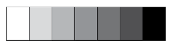
The world around is full of the entire range of value - from the purest white to the deepest black and every level of grey in between. In order to successfully create a work of art, this range must be mimicked. To do this, most artists create a value scale. A value scale is a scale that ranges from white to black with steps in between that mark the slow darkening of a color. Here is an example:
Light plays a key role when dealing with value. Our perception of light by our eyes is what enables us to see. The light reflects off everything in our field of view, is received by our eyes, and then is transmitted to our brain to be analyzed and identified. In art, we have to mimic this light reflection on the different surfaces, objects, textures, etc. in order for the mind to process it to appear like we want. We create this light reflection by using value.
The world around is full of the entire range of value - from the purest white to the deepest black and every level of grey in between. In order to successfully create a work of art, this range must be mimicked. To do this, most artists create a value scale. A value scale is a scale that ranges from white to black with steps in between that mark the slow darkening of a color. Here is an example:
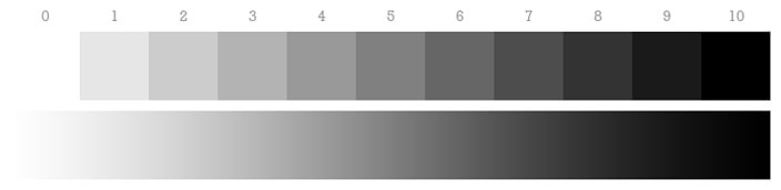
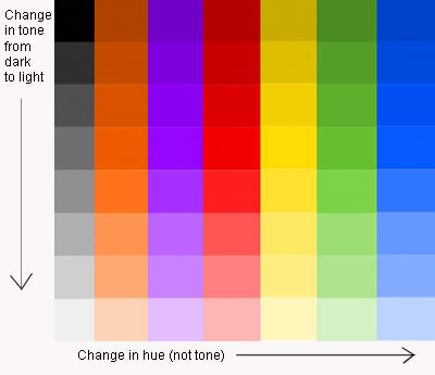
Before we go any further, we need to discuss how to identify and name the different values, or tones, on the scale. Each value scale is going to start with a hue. A hue is a pure color, unmixed with anything. The scale can be broken down into tints, neutral, and shades. A tint is any hue mixed with white, resulting in the values/tones on the lower end of the value scale. A neutral is any hue mixed with grey. A shade is any hue mixed with black, resulting in the values/tones on the higher end of the value scale.
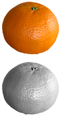
Every object will have a variety of tones to help portray it. Take a look at this orange. It doesn't look like there is a wide variety of tones in it, but when you switch it to a grey scale, the tones really stand out.
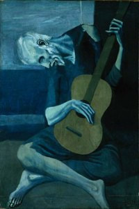
Our job now as artists is to mimic this light pattern to create a real-looking orange. Look at how Pablo Picasso used different tones of blue to create his piece The Old Guitarist.
The key to creating a successful three-dimensional piece is shading.
