Color
Color is everywhere in the world around us. It is important for artists to know how to harness this amazing resource and use it to enhance their artwork. You will be learning the basics of color and how it works in art.
So what is color? Color is how our eyes break down light that is reflected off objects. Light is made up of different wavelengths that our brains processes as different colors. Light with a short wavelength is near the purple/blue end of our visual light spectrum and light with a longer wavelength is near the red end of the visual light spectrum.
So what is color? Color is how our eyes break down light that is reflected off objects. Light is made up of different wavelengths that our brains processes as different colors. Light with a short wavelength is near the purple/blue end of our visual light spectrum and light with a longer wavelength is near the red end of the visual light spectrum.
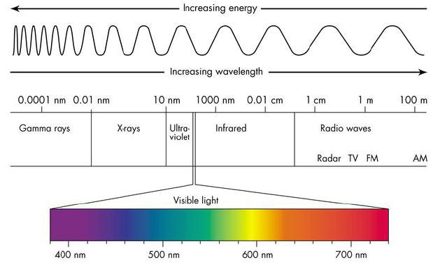
Image from: https://hobiesurfshops.wordpress.com/tag/visible-light-spectrum/
When light hits an object it is either wholly or in part absorbed and reflected. When an object appears white, all the light is being reflected. When an object appears black, all the light has been absorbed. When an object appears a particular color, such as red, that means the light waves other than those in the red range have been absorbed and the red light is reflected off the object.
Watch this video that explains this concept:
Watch this video that explains this concept:
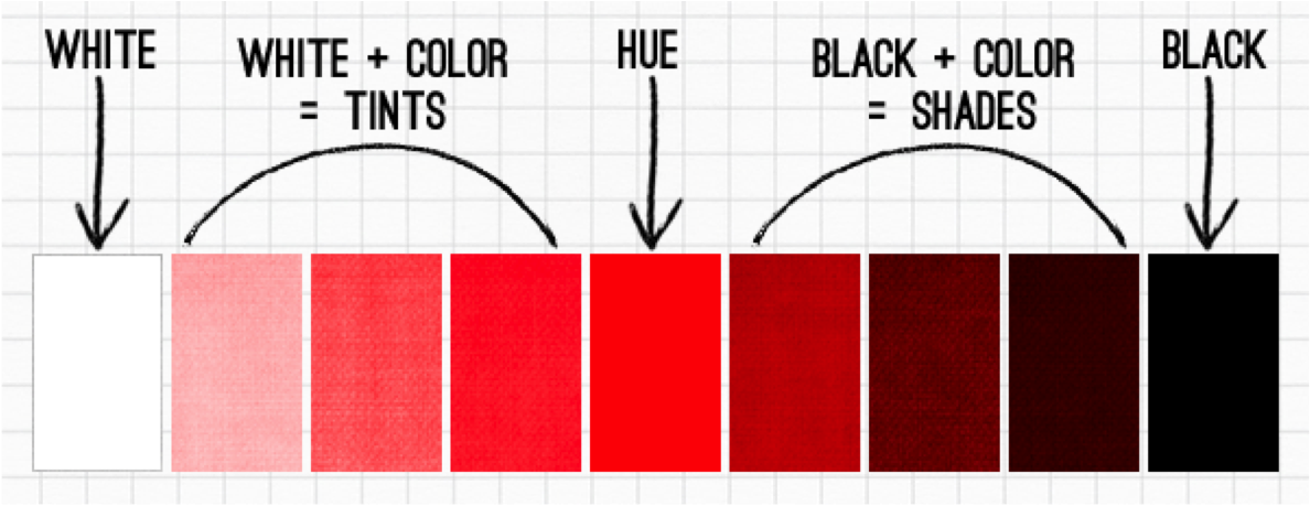
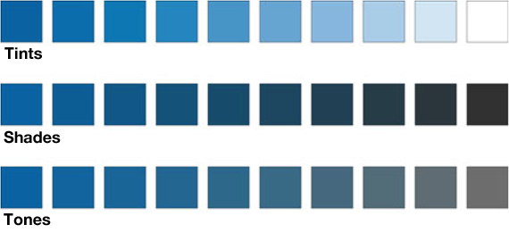
Color is actually made up of three properties. The first property is hue. Hue is the name of the color, the concept we recognize as a color and where it falls on the visual light spectrum. Examples of hues are red, purple, and yellow-green. The second property of color is value. We have discussed value before and it the same concept for color. The value of a color is how light or dark it is. However, value in relation to color is described as high-key (those colors that are closer to white) and low-key (those colors closer to black). The third property of color is intensity. Intensity is the saturation level of the original hue, basically how much it looks like the original, unaltered color. Each hue has variations that fall under the classifications of high and low key colors. These colors also vary in the intensity of the hue. This is due to colors being tinted and shaded. Tints are a hue with white added. Shades are hues with black added. Neutrals, or tones, are hues with gray added. Colors that are tinted, shaded, or toned have lower intensity levels. Look at these examples:
|
|
|
Image: https://typelayoutbmcc.wordpress.com/typographic-contrast-pt-2/
|
Image from: https://100mandalas.com/2015/11/15/color/
|
Artists have spent centuries studying color and how to describe and use it in art. The simplest way to study and use color is to learn the color wheel. The color wheel includes the primary colors and how to use them to get the color you want.
Primary colors are colors that can not be made, created, or found by mixing other colors. The three primary colors are red, blue, and yellow. From these primary colors, you can make every other color. Therefore, the color wheel is based on these three colors and how they create other colors.
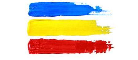
https://www.123rf.com/photo_55814518_colorful-acrylic-paints-of-primary-colors-red-yellow-and-blue.html
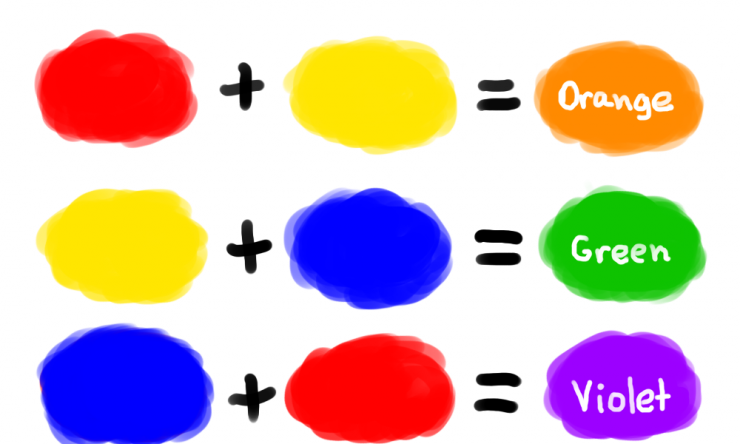
Secondary colors are those colors you create by mixing two of the primary colors in equal parts.. For example, when you mix equal parts of blue and yellow you create green - therefore green is a secondary color. There are three secondary colors - purple, green, and orange.
https://www.numbersia.com/#overlay=node/12234
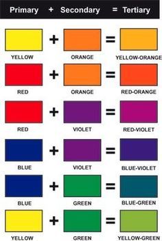
Tertiary colors are colors created by mixing a secondary color and a primary color. If you mix equal parts of green and yellow you create the tertiary color yellow-green. All tertiary colors are named for the two colors that created them, starting with the primary color. There are six tertiary colors - yellow-green, blue-green, blue-violet/purple, red-violet/purple, red-orange, and yellow-orange.
http://www.wiu.edu/users/sew100/itt351Project/Color3rd.html
Here is a color wheel with the different levels of colors labeled, see if you can name each color:
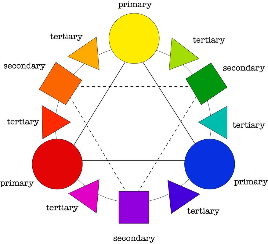
Image from: http://www.caldwellcrafting.com/page/3/
Here is a color wheel with tints, tones, and shades:
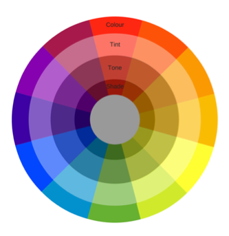
Image from: http://overthemoon-design.com/series/crafted-colour-series
How do artists use the color wheel to successfully use color? Artists use the color wheel to help them determine and successfully execute the color school they have selected for their artwork. A color scheme is the choice of colors used in a piece of art. Yes, you can choose to use every color in your artwork. However, having a particular color scheme helps to make artwork more focused, simpler, and generally more successful. This does not mean that other colors aren't used; other colors are sometimes added in, but they have very little influence on the overall color of the piece. There are several types of color schemes that most artwork can be classified into.
- Monochromatic - Monochromatic painting is the use of one color in art, sometimes coupled with shades of white, gray and black.
- Analogous - The analogous color scheme is created by colors that are next to each other on the color wheel, usually within three or four steps. For example, if you wanted to paint an ocean scene using analogous colors you could use blue-violet/purple, blue, blue-green, and green - or shift a step and use blue, blue-green, green, and yellow-green.
- Triadic - A triadic color scheme is using three colors that are equally spaced on the color wheel, such as red, blue, and green or orange, violet/purple, and green. This is where you begin to make sure that you are not using equal amounts of each color. If you use all three equally, the viewer may be confused or the piece feel disjointed. It is better to choose one color you are going to emphasis and use the other colors to enhance.
- Complementary - Complementary colors are colors that are directly opposite each other on the color wheel. For this color scheme, you will definitely want a dominant color with the complementary color being use to bolster, enhance, and add interest to the rest of the piece.
- Split complementary - This color scheme is very similar to regular complementary color except that you will have three colors. To create split complementary, you choose one color and then find the colors on either side of that color's complement. For example, if you choose red, the split complements are going to be blue-green and yellow-green.
- Tetratic or Double Complementary - For the double complementary color scheme, you choose two sets of complementary colors. They should not be right next to each other on the color, but being close does help. Normally, artists choose color only two or three steps apart.
- Warm - Warm colors are those colors that fall between purple and yellow on the red side. These colors generally remind people of fire or a sunny day and therefore give off a inviting, warm, and/or happy feeling.
- Cool - Cool colors are those colors that fall between purple and yellow on the blue side. These colors are usually remind people of the cold or a dreary day and therefore give the impression of being cold, sad, and/or depressing.
Now how do we use color as artists? There are three deliberate ways in which artists use color in their work. One way is to provide emphasis in a particular area of the painting. If you want people to see an object in an artwork first, you can use color to achieve this. The viewer's eye is drawn to the most intense color area first. By utilizing this, artist's will determine where they want the viewer to look first and make other colors in the piece less intense and less saturated than that area. A second way color is used deliberately in art is to guide the viewer's eyearound the painting. Like we discussed, viewers are usually drawn to the most intense (or saturated) color first. By varying the intensity of colors in the painting, an artist can help draw the viewer's eye around the piece to key features by starting with high intensity and then lowering the intensity on subsequent objects. The third way that color is deliberately used is to change the mood of the art or provoke an emotion. Color has been linked to emotions throughout history. Blue is usually sad, green is usually jealousy, red is usually anger, and there are many more. Furthermore, colors are also used as symbols - purple for royalty, white for purity, black for evil, etc. Therefore, by using specific colors, art can be made to influence the viewer into thinking the work feels sad, or angry, or pure, or evil. Additionally, the use of specific colors on certain items help to tell a story or convey a message about the painting. An image with a man in black and a man in white generally makes a viewer think good vs. evil. Having characters in work be draped in purple next to other characters in more neutral tones portrays royalty or a person of importance. Having light or a brighter area around one object while the rest of the piece is dark usually provokes a feeling of purity, hope, or innocence. It may be subtle, and subconscious for the viewer, but the way color is used can actually determine how people will react to and feel about the artwork.
Here is a worksheet to review the information:
| Color Notes Worksheet |
These videos explain the main points and give really good examples. They are a little long, but worth the watch.
